UX Trends For Small Business Websites
This was originally published on speckyboy.com. Andrew James explains the best UX trends of modern design. Andrew has been involved with Amazon and authority web design for almost a decade now. He enjoys being in the trenches and doing all the hard work in order to transform someone’s old, ugly side-project into the real money making machine it is. Top image courtesy of Rawpixel.com via Bigstockphoto.
With smartphone and tablet technology catching up to desktops and laptops, web design and user experience needs to catch up, too.
If you toss together a design based off a wireframe template, hand it off to a copywriter, and then turn everything over to a marketer, you’re going to miss crucial pieces of the puzzle that can all come together to turn a winning design into a hugely profitable business asset.
There are 6 trends that are making big moves into designs from smaller mom and pop shops, up to Fortune 500 companies that, as a designer, you need to pay attention to.
Endless Scrolling Layouts
Millennials are making up a bigger sector of internet users, so if you want to get their attention — and keep it — your designs are going to have to reflect the type of personality and attention span that Millennials are known for having.
Short attention spans, and wanting information quickly without having to browse through dozens of pages, or getting put off by a huge wall of text are all qualities that Millennials exhibit.
That means they don’t want to land on your page, only to see a ton of text that they have to scroll through, or get redirected through multiple pages before they finally reach their destination.
Instead of pushing them away with a ton of information (which they do actually want), spend time focusing on endless scrolling designs.
When a visitor lands on the page and sees a short scrollbar on the right hand side of the screen, they’re not going to get discouraged knowing they have to keep scrolling to get through everything.
Instead, they’ll start consuming the information, and the long-scrolling will continue bringing in new information as the user continues down the page. By the time they’re done reading and browsing, they’ll have taken in a lot more information than they thought they were going to, and you’ve substantially increased their engagement.
Replacing Carousels & Sliders With Hero Shots
Carousels and sliders were never really a feature that worked, but it didn’t stop countless designers from putting them into their projects. Both tend to slow down the design, and distract visitors away from the end goal — making a conversion.
Instead of loading your pages down with heavy carousels and sliders, new designs are making good use of the hero image. If you’re unfamiliar, it’s the massive pictures you see that take up the entire screen as a visitor lands on the page, and instantly grabs their attention.
They’re becoming popular because they take up minimal bandwidth, and don’t slow down the visitor’s browser like Javascript heavy carousels and sliders do. With smaller screens, they also make a bigger impact than functionality that may not be supported.
Designing & Adapting To Active User Interactions
User experience requires you to focus on getting inside of your user’s head, and delivering exactly what they’re looking for so that their engagement with your design is practically seamless. You want to be accused of reading their mind, while you’re leading them down the path you want them to go.
While highly experienced developers that are working together with marketers and customer research teams can put this together, most designers aren’t going to have the information they need when they’re putting the project together. That’s why you have to spend time testing different aspects of your design on the open market.
You need live feedback from customers who are actually using their site. The best way to get this information is by using heatmaps to determine where your visitors spend the most time, where they’re clicking, stopping to read, and what may be missing along the way to converting them into a customer.
In a live fire situation, heatmaps, combined with live chat and outright asking the visitor how your design can help improve their engagement and user experience are practically invaluable — and information that you won’t necessarily have when you start the project.
Focusing On Micro-Commitments
Getting a “yes” out of your visitor is the first step you need to be taking to getting them to convert into a paid customer somewhere down the line. They’re the heart of conversion rate optimization, which is a skillset that all designers and developers need to have in their arsenal.
Check out this post by Ryan Levesque on Crazy Egg. In it, he breaks down the smaller steps that you need visitors to take before you can get a major commitment out of them — a purchase or entering into your marketing funnel so you can convert them into a purchase later on.
The best way to get a “yes” out of them is to simply ask a question. Questions instantly connect you to your visitor, and let them know that whatever you’re offering is speaking directly to them, and reduces the chance that their fear responses are going to be triggered.
Implementing Artificial Intelligence
We’re in the big data age, and if you’re not collecting data on how your visitors interact with your designs, you’re missing out on huge opportunities to keep them engaged.
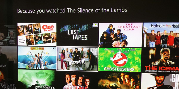
Take a look at Netflix for instance. Their active engagement from users is through the roof, and it relies on a combination of artificial intelligence and collecting data about their users. Every time a customer watches something new, it’s tagged in a database and other related titles are brought up so they can keep the person entertained.
The best example of this is their “Because you watched…” panels. Their end goal is to make sure visitors always have something to watch and engage with when they’re using the platform.
Copywriters & Content Marketers Working With Designers
Getting engagement out of your visitors doesn’t just fall on the designer’s desk, anymore. Full teams are required to get the most traction out of a web design project, and that requires everyone who is going to be working to convert the visitors into customers to work together.
Building a design that works to keep from frustrating your visitor is one thing. Creating copy that not only gets in your visitor’s head, addressing their pain points and concerns, while also making the marketer’s job easier is a completely different story altogether.
Most projects are built one step at a time. First, the designer takes a wireframe and puts it together. Then, a copywriter comes in a puts a bunch of words on the page. Finally, the marketer takes what he’s been giving and tracks down an audience.
Those days are gone, though, because the flow between the design, the copy, and the marketing all need to work hand, in hand, and that’s only possible when all 3 teams are working together during the development stage.
Conclusion
If you’re willing to work together with the other professionals that will be involved in making sure your design delivers on the promises you’ve made — the copywriters, and marketers — and takes data from visitors using the site, as well as customers that have been converted, your life will be a lot easier, and you’ll have a lot more happy clients.
A reputable web design and marketing agency will understand the subtle nuances and what is required to grab a Millennial’s attention, and then keep it. This type of in-depth branding goes a long way toward making your marketing campaign successful not only with Millennials, but with visitors of all ages. Brand Builders specializes in delivering a custom user experience that helps turn your visitors into paying customers.


Leave a Reply
Want to join the discussion?Feel free to contribute!