Scrolling in Web Design: How Much Is Too Much?
Enter the world of scrolling with this Speckyboy‘s article. About the author: Stephen Moyers is an online marketer, designer, avid tech-savvy blogger. He is associated with Los Angeles based SPINX Digital Agency. He loves to write about web design, development, online marketing, social media and much more. Feature image courtesy of grapestock via Bigstockphoto.
Scrolling may seem like a very basic feature of a website, and essentially, it is. However, despite its basic functionality, the scrolling on your website can either work to users’ benefit or drive them bonkers, pushing them to your competitors’ sites.
Some websites employ “infinite” scrolling – you scroll to the bottom of a long homepage only to see the scroll bar jump back to the middle of its track as more content loads at the bottom. This type of scrolling can be effective in some cases, but it will frustrate users more often than not. It’s important to recognize where scrolling is effective, and what type you should use.
Complexity Demands Simplicity
Websites are more robust and content-rich than ever before, and thusly designers have conceived new ways of filling a screen with information without overwhelming users. This is especially true now in light of the fact that mobile device users outnumber desktop users. Designers must fit a great deal of content onto relatively small screens, necessitating some measure of scrolling.
Tiled design is the idea of creating bite-sized pieces of content (which are usually interactive links to more detailed content) for quick and efficient browsing. Couple this concept with scrolling and you can provide users with a seemingly endless content stream.
Scrolling is also naturally attractive on mobile devices. Swiping a finger is a simple, easy, yet precise motion. Users quickly learn how to swipe to reach the bottom of a page quickly, or slowly to get to the next relevant piece of content.
Types of Scrolling
Depending on your brand image and customer base, the type of scrolling you should feature on your website is going to vary. When deciding on which method to employ, think about how it will interact with the content you provide. There are four basic types of scrolling:
1. Long-Scrolling
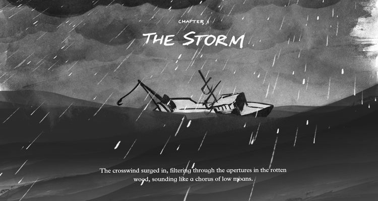
The advantage to long-scrolling is you can create a single page of seamless content. This offers a smooth, linear browsing experience to users, and naturally lends itself to storytelling.
The Boat is a fantastic example of long-scrolling
As a user scrolls, they can absorb more of the story in a natural way, offering a more immersive browsing experience. Many sites opt for a single page with long-scrolling, but one major disadvantage to this configuration is it may hurt your site’s SEO. Websites with multiple pages tend to fare better in terms of SEO.
2. Fixed Long-Scrolling
Rather than have the entire page scroll, a fixed long-scrolling configuration keeps some content static while other content scrolls. Alternatively, you can set up your scrolling so when a user reaches a certain point, the static content shifts to a new section.
This is great for sites that don’t want to convert to a single page due to SEO concerns.
3. Infinite Scrolling
For sites that offer extremely dense amounts of content, there may be too much to load onto a single page at once. With an infinite scrolling setup, you essentially create a rhythm. Most social media, such as Facebook, Tumblr, and Imgur are all configured for infinite scrolling. This allows users to continuously browse fresh content.
The only drawback to this is that users will be very frustrated with losing their place. If you believe that infinite scrolling would work well with your site’s content, then you should investigate sticky navigation, a toolbar or set of buttons that allow users to quickly jump back to the top or to specific areas.
4. Parallax Scrolling
Video game enthusiasts are going to feel right at home with parallax scrolling. Older video games that took place in two-dimensional environments didn’t have the technology to create the vast, three-dimensional, hyper-realistic environments seen in recent games.
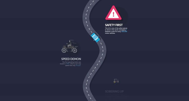
Parallax Scrolling Example: Braking Badly
Older 8-bit and 16-bit games such as Sonic the Hedgehog, Mega Man, and Super Mario Bros were often called “side-scrollers.” This is because the player moved from left to right to complete a stage, and depth was created with motion. The foreground and background would move at different speeds, creating a visual sensation of depth. Parallax scrolling in website design really shines when you can work in scroll-triggered animations.
Best Practices for Scrolling
The type of scrolling you use on your website should depend on your content. The basic function of scrolling is to allow users to digest as much or as little of your content as they wish, so it’s important to tailor the experience to your offerings.
Extremely content-rich sites may want to investigate infinite long-scrolling. This method works for social media – especially on mobile platforms – because there is simply too much content to digest in a single page, and attempting to fit every bit onto individual pages would be both impractical and unengaging.
Let your content dictate your scroll length. You can also trim scrolling with simple buttons that say “Scroll for More” or “See More.” Allow users to decide whether or not they want to keep going, and your pages will not only load more quickly, but human curiosity is going to get users to click for more quite often.
Your user data will tell you a lot about how your users interact with your site and whether or not you should rethink your scrolling configuration. When a user visits your page, the first thing they see is the top. The bottom of their view is called a “fold,” and your Google Analytics can tell you how many users click below it and how often. This metric will tell you whether or not your current scrolling setting and site layout are encouraging users to keep scrolling down to see what you have to offer.
Sticky Navigation is a Great Tool
Regardless of what type of scrolling you choose for your site, sticky navigation is a great way to keep users feeling in control as they browse your site. Think of a web-based email client like Gmail: you can scroll down your inbox, but the bar to the left of the screen has buttons for switching between accounts or accessing different folders. Users can scroll at their leisure, but they always have the option to jump to an exact section.
Any type of site can benefit from sticky navigation. If you employ infinite scrolling, users will probably like having the ability to jump back to the top of the page with one tap, rather than continuously swiping. You can also create a header that remains on screen no matter how far down a user scrolls, offering instant access to essential functions.
Pros and Cons
As more people turn to mobile devices for browsing the web, scrolling seems to be a natural choice for websites. Of course tapping various links is quick and easy, but most users prefer to have quick access to the bulk of a site’s content as quickly as possible. You can engage your users with a robust content offering, and you won’t overwhelm them if you offer a measure of control.
However, it’s important to remember that large blocks of content or multimedia can slow down your page loading speed. This could be damaging to your users’ experiences on mobile devices, since many will be browsing with either cellular data or weaker-than-average Wi-Fi connections on the go.
You may also need to sacrifice your website’s footer. Almost every website has a footer at the bottom of the page with precise links to the company profile, where to submit a job application, contact information, and other general information. You can eliminate the need for a footer by using sticky navigation tools that users can click to go to specific areas of your site.
If you’re designing for mobile device browsing (which you should be), then the benefits of scrolling far outweigh the drawbacks – as long as you configure your site’s scrolling wisely. Mobile devices inherently encourage interaction and with wisely-crafted, responsive web page design, your users will delight in unique ways to absorb your content.


Leave a Reply
Want to join the discussion?Feel free to contribute!