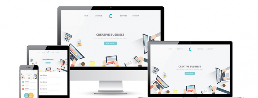
Use responsive web design or design mobile first?
Mobile first and responsive web design are huge words in the web design world. Are they actually different things? This article is originally from GoDaddy. The author is Nathan Reimnitz. He is is a certified expert WordPress developer from Scottsdale, Arizona. Nathan is a full-time freelancer for Codeable.io, Clarity.fm, and GoDaddy Pro Connect. Image courtesy of MPFphotography via Bigstockphoto.
Learn mobile web design with mobile–first, adaptive, and responsive web design concepts. Review the best practices with our Journey into Mobile course
You probably remember the big digital cable transition of a few years ago. Basically, all analog broadcasting ceased to exist after the cutoff point, rendering some older television sets useless. The past several years in web development experienced a similar shift: either your website is responsive or it’s obsolete.
For developers, this has raised some interesting questions and challenged the approach on each project. Being “mobile-friendly” is one thing — great, there’s a version of your site that loads on a tablet. Gone are the days when this was all you needed to check the box for mobile design, even if the user experience was maddeningly unfriendly. But with search algorithms (namely Google) overtly favoring sites with more mobile responsiveness, developers now face a strategic decision from the get-go.
Designing for mobile first versus responsive web design is not a chicken-and-egg conundrum; one can exist without the other.
The debate comes down to a question of need from project to project — and only after you’ve considered your audience and your future marketing efforts will you find your answer.
Mobile-first vs. responsive web design: Determine user needs
A responsive site displays identical content across all devices while conforming to the container with which a user interacts. From a user experience standpoint, mobile design should still be “responsive” in the way images, text and menus work together in a kinetic chain to fit the device they’re viewed on. Likewise, they should adapt to the user’s behaviors.
For designers, the question becomes, which influences the other?
Honestly, when I first started wrestling with this question myself, I was wholeheartedly in favor of responsive web design above all else. Imagine building a house — you wouldn’t start by framing up and fully decking out one bathroom before you even thought about the next room, right? That’s a bit what designing for mobile first is like when you also have a desktop version to think about. But there are some cases where it makes perfect sense to think more compactly first and optimize for mobile.
At the onset of a project, ask yourself about the target audience for your site. Specifically, which devices will they use the most? Primarily mobile? Primarily desktop? Or a combination of both?
When mobile-first works
An example of a primarily mobile site might be one developed specifically to support an app or mobile game, where marketing efforts are focused on mobile device conversions. In other words, site users already have the end device in their hands, so the experience should be tailored to them. I’m not so much interested in wowing users with design elements that are impressive on a desktop screen at this point. Chances are, users will never even end up on the desktop version of the website for this app.
Websites for businesses that skew towards more impulsive user decision-making — like restaurants and certain e-commerce stores — also benefit from a mobile-first approach. In these cases, examining which devices lead to the majority of sales (not just traffic) will clue you in as to the specific content you should be delivering and how to design your site to best optimize it.
When responsive web design is better
On the other hand, if you’re designing for primarily desktop, or a combination of both, I lean toward crafting a bad-ass responsive experience and then stripping away bits that don’t work on mobile.
It’s no longer standard practice to create a separate “mobile version” of a site that lives independently of the desktop version (we’ve all seen the m. subdomains which are now deader than MySpace). Understanding that a responsive website will deliver identical content across all devices means developers need to be smarter and more efficient when determining exactly what that content will be.
Still, the design is influenced top-down from the desktop, not bottom-up from mobile. There’s a difference between thinking about how a site will look or perform on a phone, and designing phone wireframes first. I’ve seen plenty of instances where mobile practices are applied to desktop sites to the detriment of the design and user experience. Going at it that way makes for lazy designers and ultimately websites that miss the mark.
The verdict
As a designer, do you want to have a completely blank canvas on which to work, with an infinite number of colors to choose from (or, at least, a lot more than will fit in a 16-color crayon box)? That’s what responsive-first design allows you to do. Mobile has re-trained the developer brain to think and act with no wasted effort, which is great — web design should only cover what’s absolutely necessary. But starting from a place of limitation with mobile can gridlock your most interesting ideas because of real estate and functionality confinements.
Both responsive-first and mobile-first design present their own unique challenges. From my perspective, I would much rather start with a toolbox overflowing with options, design the best experience possible, then tweak and refine down until the different requirements of desktop and mobile meet at the best possible intersection.


Leave a Reply
Want to join the discussion?Feel free to contribute!