Stay Focused: 5 Types of Content Specific Landing Pages that Convert
Reading this post you’ll learn some key elements every successful landing page needs. About the author: Andrew Smyk (blogs.adobe.com) coordinates a postgraduate program in Interactive Media Management at Sheridan College and writes about how kids adapt and use technology on his blog. Follow him on Twitter: @andrewsmyk. Image courtesy of PureSolution via Bigstockphoto.
Content specific landing pages should be just that – web pages that focus on delivering specific messages to your audience to accomplish specific goals and grow conversions through calls to action. The specific functions of landing pages can cover everything from sales (lead generation) to informational newsrooms and beyond.
Whereas, homepages tend to be general and offer more casual informational content to the user, landing pages have a specific function and curated content.
Stop Going Around and Around to Get Started
Before starting on any landing page or microsite project, the first design consideration is to drop the use of a banner or image carousel. Click through rates on carousels are extremely low, so using them is counterproductive to messaging and bad for conversion. Carousels fail the 5-second test for user recall of page content and do not provide the perceived benefit. Metrics from the University of Notre Dame web department showed that the interaction statistics were “1% clicked on a feature and 84% were the first position only.” Most users have already scrolled down the page or have moved to other content before carousels have fully loaded onto the page.
Carousels offer a quick solution to content presentation and messaging problems, but do not offer the desired results. Should I use a carousel? Now you know the answer.
Let’s look at five different types of content specific landing pages, and the design considerations for them:
1. Click-Through Landing Pages
The primary goal of click-through pages is to deliver the CTA (call to action) message and provide the context to prompt the user to further explore the site or quickly sign up for the service and complete the onboarding process for the product or service. Click-through pages need to have a clear and simple layout to have users complete conversions.
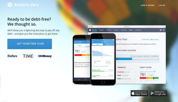
Ready for Zero uses the tagline “ready to be debt free” combined with the call to action “get your free plan” on a page that highlights the product features and quick links to download the mobile app.
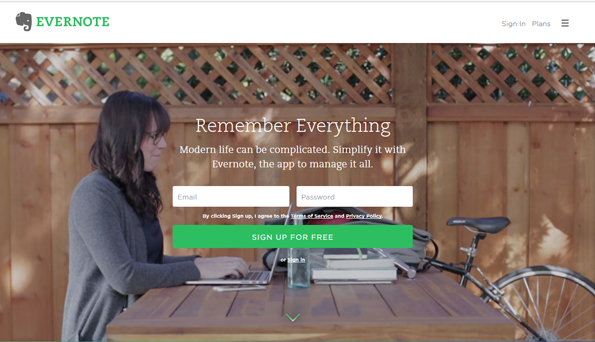
One of the most basic and common landing pages is the get started/login page. Tumblr uses user generated content and bookends the landing page with sign-up/logins screens. The Evernote redesigned landing page wants you to “remember everything” and sign up for free. The page uses a mix of video and showcasing the features and benefits of the service. Users can explore the range of services and begin onboarding with an email and password.
2. Virtual Landing Pages
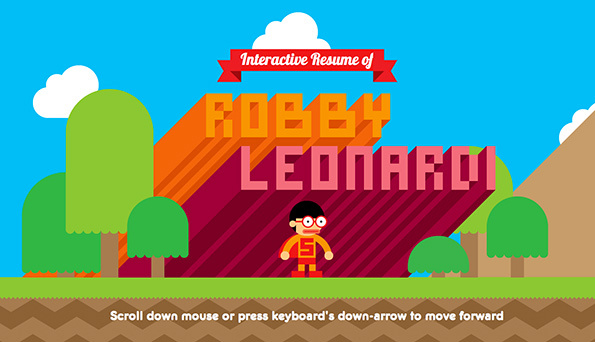
Virtual landing pages leverage interactivity and multimedia to generate interest in a product or service. The goal is to generate interest through word of mouth and social media sharing to increase traffic to the site. The Super Mario Bros-inspired interactive resume from Robby Leonardi mimics side scrolling game animation and mechanics to move you through the resume. The more you interact and move through the experience, the more you learn about the person’s skills and work experience.
3. Microsites
Microsites can be single page scrollers, stand alone websites or “websites within a website” that provide the user more informative content about a product or service. They often take the form of promotional campaigns or new product/content launches to immerse and maintain the user’s attention.
The Lomokino is a classic microsite in terms of content and presentation that also takes a textbook approach the concept right down to the “microsite” subdomain.
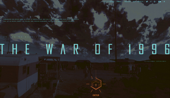
The movie industry utilizes microsites for promotion and user engagement. Microsites also offer the user a deeper range of interactive and multimedia content that enhances the storytelling. For the upcoming Independence Day 2 release, Fox Studios created a microsite called The War of 1996 to provide moviegoers with a fully immersive backstory and details of the events from the first movie as well as the storylines moving forward to the summer release of the sequel to Independence Day.
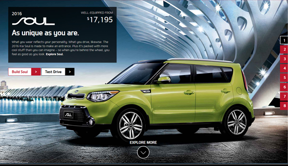
Microsites can help direct users to content within a website and provide information that allows users to learn more about a product or service. Kia Motors uses a “websites within websites” format for each of their car brands with simple URLs and complete stand alone content. The Kia Soul page is a mix of marketing, lifestyle promotion, purchase decision tools, and multimedia content.
4. Lifestyle and Brand
The interactive content is designed to engage the user with interactive video, animation, or game-like content that is fun while reinforcing the brand or product. TheQ camera site uses a mix of product lifestyle videos and slice of life images to promote features and the moments that you can capture with the camera.
Burton’s brand has always been about lifestyle and the company’s landing page reinforces that message through product images and supporting taglines.
These types of brand related product detail sites are full of information and imagery of the product lines that can be distracting to the user. Multiple navigational choices can lead the user a stray within the site and away for the primary product they came to view.
5. Opt-In or Lead Capture
Lead capture pages offer users incentives, directly or indirectly, in exchange for personal information. This can be something as simple as having users provide, as with UXpin, their email addresses to start a free trial or access to a library of ebooks. Blood Root Blades uses lead capture to create product exclusivity. The opportunity to purchase the company’s artisan knives via a lottery system is only available to newsletter subscribers. Remember to keep onboarding forms on these types of pages simple and clean.
Other Design Considerations
Message Matching
When building any type of home, landing page or microsite, it is important to have your call to action and other messaging match with the link or display ad that brings the user to your page. Users will quickly leave your page if the call to action that brought them to your page is not presented or is missing. Not only should calls to action, content phrases or copy match but it’s important for banner ads and landing pages to have visual consistency to reinforce the message matching. Nobody wants to go to a restaurant where only half of the menu items are available.
Say Goodbye
Remember to provide users with a well crafted goodbye message on the chance that they wish to opt-out of receiving an email newsletter or have decided to close their account. A personalized and sincere message can be the difference between losing and retaining a customer. Give users a second chance to rethink their decisions to leave and unsubscribe.



Leave a Reply
Want to join the discussion?Feel free to contribute!