16 of the Best Landing Page Design Examples You Need to See in 2017
Learn from 16 of the best landing pages to create your own high-converting page
How do you convince your visitors to take the plunge on your website?
There are so many elements that a top-notch landing page needs, and making those elements the “best” they can be often depends on what your landing page goals are.
Take form length, for example. It’s just one of the many components you need to optimize, but best practices will tell you that both short and long forms perform well — it all depends on whether you want to generate a lot of (potentially) lower quality form submissions, or a smaller number of higher quality submissions.
So if you’re looking to up your landing page game, it’s helpful to know what goes into a great landing page and see a few examples of these nuanced elements in action. Surprisingly, when I started doing research into the latter, I realized there are hardly any sites out there with examples of modern, impressive landing pages that are more than just a sign-up form on a homepage. So we decided to compile a list of landing pages we love ourselves.
Big, big caveat here: I don’t have access to any of the stats for these pages, so I can’t tell you how well they convert visitors, leads, and customers. Still, these examples have some of the best combinations of those nuanced landing page elements I’ve ever seen. Obviously, if you feel inspired to try any of these tactics on your own site, the only way to know whether they’ll work for you for sure is by testing them out for yourself.
16 Examples of Great Landing Page Design
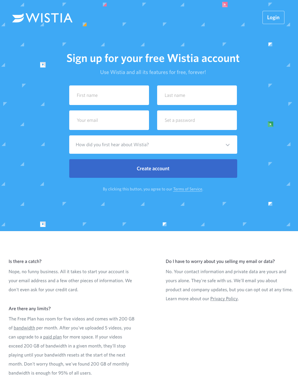
1) Wistia
First up is Wistia’s landing page for their Free Wistia Account. Right off the bat, you notice the one-field form to create your account — the blue, minimally patterned background contrasts nicely with the bright white form field.
The length of the form field combined with the prominent placement eliminates nearly all friction to create an account … but if you’re having doubts, you can always scroll below to read answers to top FAQs. By separating these two sections with stark color contrast, Wistia makes it much easier for you focus on converting.
2) Unbounce
It’s no surprise Unbounce is near the top of this list — they’ve actually written the book on creating high-converting landing pages. Although there are lots of amazing things about this landing page, the two that I absolutely love are: 1) The use of a chat window instead of a classic form, and 2) the detailed — but well packaged — information below the form.
The first helps direct attention to the goal of the page — for you to fill out the form — in a way that’s unobtrusive and feels less like a chore. The second gives this page an SEO boost (search engines will have more content to crawl) and assuages any worry from folks who need to know more about a piece of content before handing over their information, all while not distracting people from the chat window.

3) IMPACT Branding & Design
Full disclosure: IMPACT is a HubSpot partner — but that’s not why they’re included here. IMPACT’s landing pages have long been a source of design inspiration. I love the simple layout of the page, from the large headline copy and detailed featured image, to the outline that surrounds the form, to the colors and fonts that are very pleasing to the eye.
Notice that they’ve included a check box to subscribe to their blog, which is automatically checked. Note that while adding a check box field to your landing page forms is a great way to increase subscribers, it’s better to leave it unchecked and let users opt in. Otherwise, you’ll risk adding a lot of low quality subscribers to your contact base.

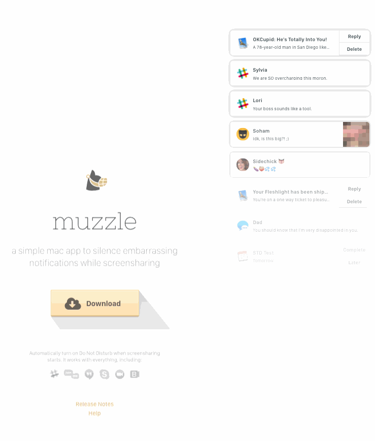
4) Muzzle
Landing pages help users decide whether or not your product or service is actually worth their precious time and energy. What better way to clearly and straightforwardly communicate your value proposition than by confronting visitors with the very problem your app solves?
Muzzle, a mac app that silences on-screen notifications, fully embraces this show don’t tell mentality on their otherwise minimal landing page. Visitors to the page are greeted with a rapid-fire onslaught of embarassing notifications in the upper left of the screen. Not only is the animation hilarious, it also manages to compellingly convey the app’s usefulness without lengthly descriptions.
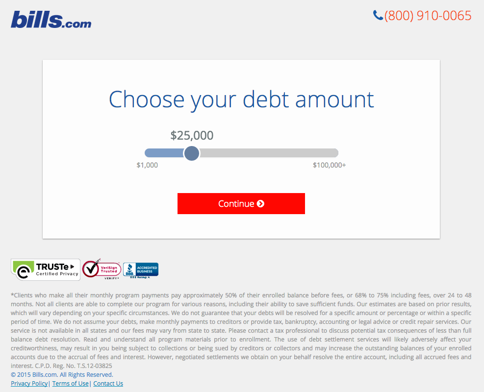
5) Bills.com
Often, people think landing pages are static pages on your website. But with the right tools, you can make them interactive and personalized.
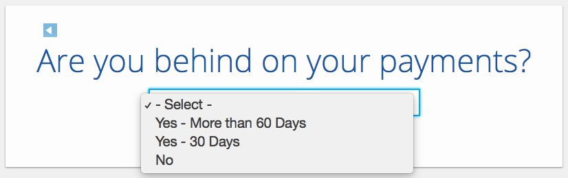
Take the example below from Bills.com. To see if you’d benefit from their consultation, you answer three questions before you are shown a form. It starts with this one:
Then, you answer two more questions, like the one below:
And here’s the final landing page form where you fill out your information:
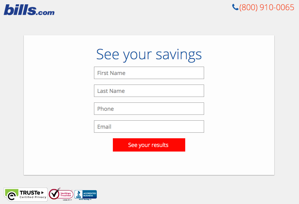
I’m not sure how the algorithm works (or if there’s one at all), but while I was filling it out, I had some anxiety about not qualifying. Once I found out I did, I was excited to fill out the form, which I’m sure most people who are in debt and using this tool are. By making this offer seem more exclusive before the form appeared on the landing page, I’d bet that Bills.com increased conversions pretty significantly.
6) Trulia
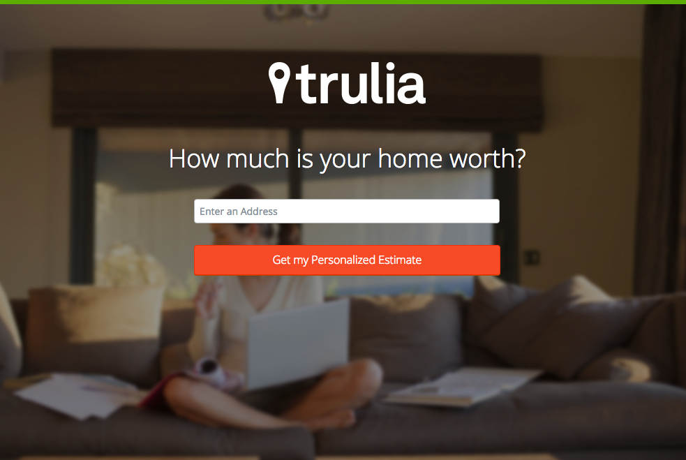
Trulia did something very similar to Bills.com with their landing page. It starts with a simple form asking for “an address” (which sounds less creepy than “your address,” although that’s what they mean). Below this simple form field is a bright orange button that contrasts well with the hero image behind the form, and emphasizes that the estimate will be personalized to your home.
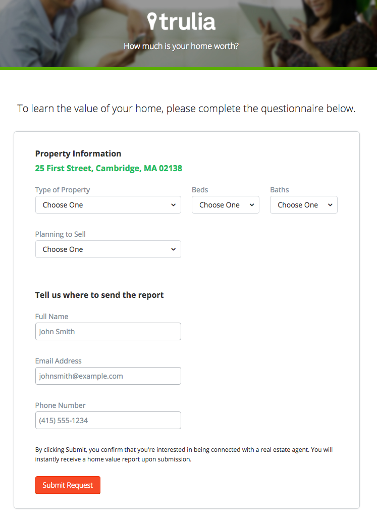
Of course, the address itself won’t be enough to estimate the value of a home. It just denotes the home’s neighborhood. That’s why the next page follows with more questions about the property itself, like number of beds and baths. Below, you see the copy “Tell us where to send the report” — with a disclaimer that, by entering this information, you’re agreeing to connect with a real estate agent. This is a great example of a company giving value to their visitors from the get-go, while setting visitors’ expectations about what will happen as a result.
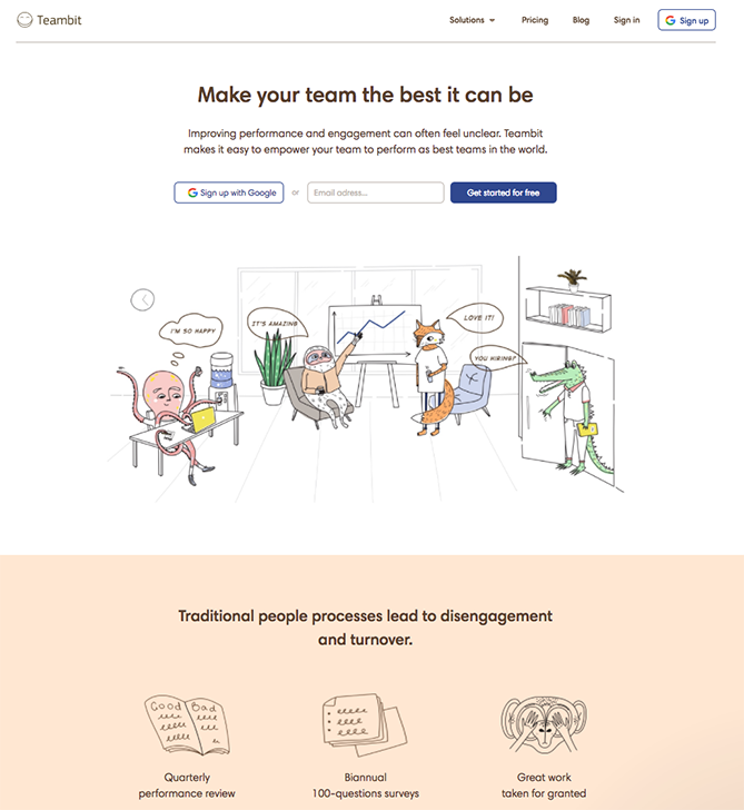
7) Teambit
Whimsical isn’t usually the first word that comes to mind when you think of HR software, but Teambit’s illustration-heavy landing page is exactly that. A simple, one-field form is accompanied by a delighful office full of animal characters — all of whom are very pleased with Teambit, in case you were wondering. An animal cartoon appears beside each informational section of the landing page, keeping visitors scrolling down to learn more.
Teambit’s landing page is perfect proof that you don’t need to have a conventionally “fun” product or service offering to create a fun landing page.
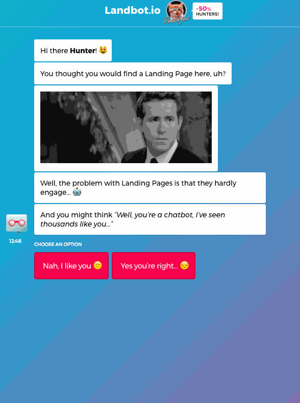
8) Landbot
Landbot, a service that creates chatbot-based landing pages, puts their own product front and center on their chat-fueled landing page. Visitors are greeted by a friendly bot — complete with emojis and GIFs — who encourages them to provide information in a conversational format, instead of via a traditional form.
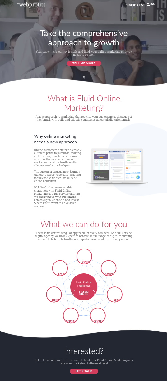
9) Webprofits
For a little contrast … what about long landing pages? With just a few tricks, you can make even the longest landing page feel short. Webprofits’ landing page below shows us how.
Right at the top, there’s a prominent CTA button to learn more — with a nice contrast against the background so it stands out, and a downward arrow to encourage scrolling. By not putting a form field up front, they help reduce friction and create an opportunity for visitors to learn more before being presented with a conversion option.
They also make it easy for you to figure out what Webprofits actually does. The rest of the page offers detailed information about what you’ll get when you give over your information. Plus, it includes strategic CTAs throughout to take you back to the top to fill out the form, like “Let’s Talk.”
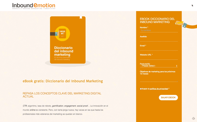
10) Inbound Emotion
Even if you don’t speak Spanish, you can still appreciate the conversion capabilities of this HubSpot partner site. My two favorite features of the page? The form stays in a fixed, prominent position as you scroll through the site. I also love the hands that serve as directional cues toward filling out the form and sharing the page with others.
11) H.BLOOM
Sometimes, you’ve just got to stop and admire a landing page for being beautiful. Using high-resolution photography and lots of white space, H.BLOOM’s landing page is a pleasure to look at.
Aside from its beauty, the page has some great conversions elements: an above-the-fold form, clear and concise description of what’ll happen when you fill out the form, and even the bright orange “Submit” button. The only thing we’d change up? The copy on the “Submit” button — that could be more specific to the offer at hand.

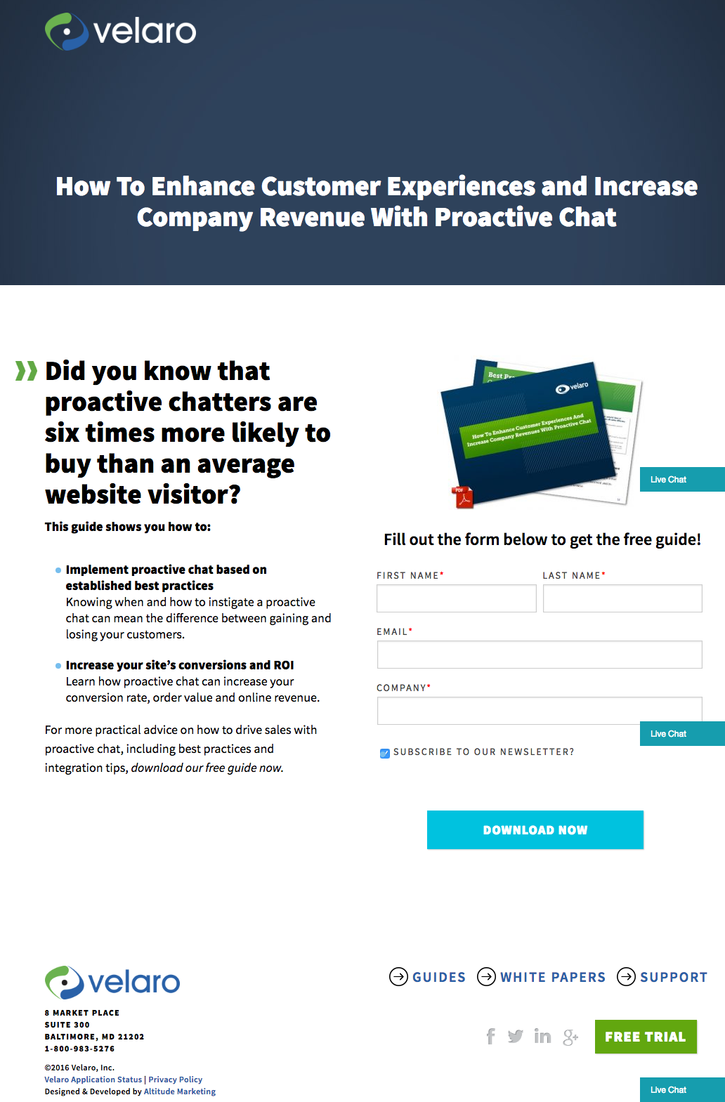
12) Velaro Live Chat
Sometimes the smallest details make the biggest difference. They’re what make Velaro Live Chat’s landing page awesome, for example.
That small PDF symbol over the feature image helps set expectations for what format the download will be in. The arrow in front of the subheadline helps further direct your attention to important copy they want visitors to read. Like IMPACT, they also have an auto-checked box to subscribe to their newsletter on their form — which, if turned into an opt-in check box, is a great way to increase subscribers. All of these small, seemingly insignificant details help bring together a solid, admirable landing page design.
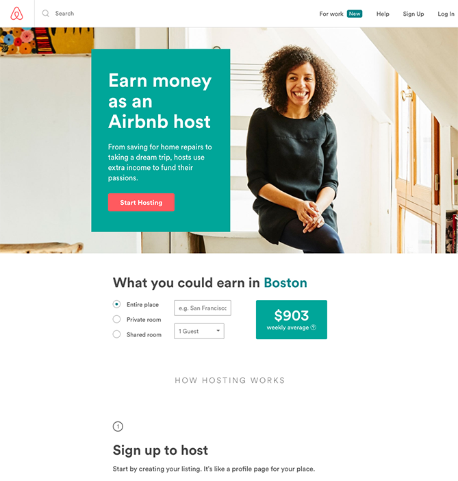
13) Airbnb
To help convert visitors into hosts, Airbnb offers some enticing personalization: an estimated weekly average earnings projection based on your location. You can enter additional information about your potential accommodations into the fields to get an even more customized estimation.
If you visit the page already convinced, the clear call-to-action at the top of the page makes it easy to convert on the spot.
14) Conversion Lab
While I wouldn’t typically include an example of a homepage with a form on it in a post about landing pages, this website is special. The homepage is the entire website — the navigation links just take you to the information below.
When you click “Get Help With Landing Pages,” the entire site moves over to make room for the form. Here’s what it looks like before you click:

And, when you click that CTA, check out how the form appears:
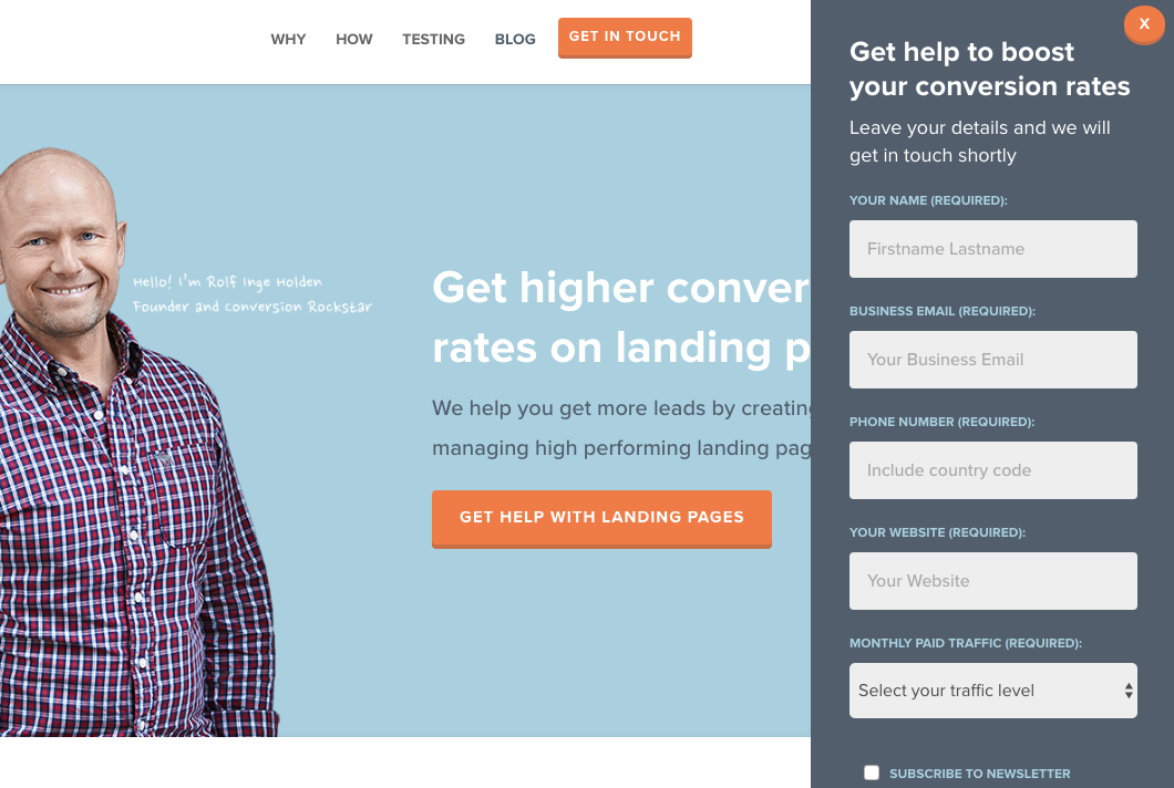
I love how you don’t have to leave the page to fill out the form, yet the form won’t feel intrusive to casual website visitors.
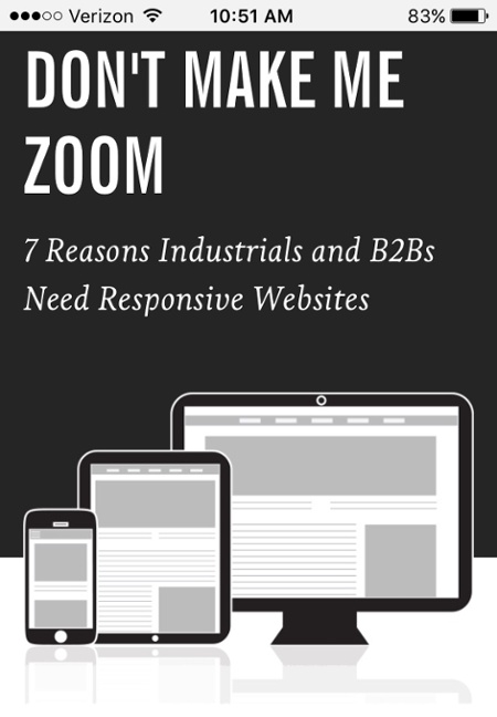
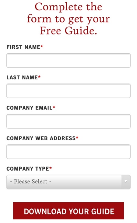
15) Industrial Strength Marketing
Right off the bat, this landing page pulls me in with a compelling, punchy header: “Don’t Make Me Zoom.” It directly speaks to a common experience most of us have had when we’re browsing on our phones or tablets — and it’s a little sassy, too.
But that’s not the only thing keeping me interested in this landing page. Notice how the color red is strategically placed: It’s right at the top and bottom of the form, drawing you even closer to the conversion event.
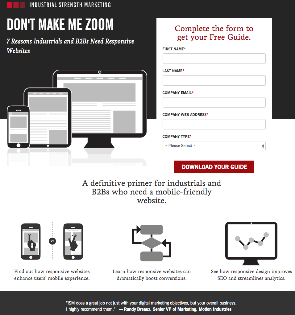
Plus, this design is meta to boot: It looks and works great on mobile, too. Keep in mind that a lot of visitors will be accessing your landing pages on their smartphones or tablets, and if the design of your website doesn’t work well for them, they might give up and leave your page.
The folks at Industrial Strength Marketing made the fonts and form field big enough so that visitors don’t have to pinch-to-zoom to read and interact with the content, for example.
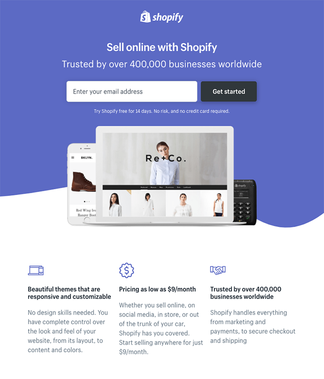
16) Shopify
Like many of the other landing pages in this post, Shopify’s trial landing page keeps it simple. The user-oriented headline is just a few words, for example, and the page relies on simple bullets, not paragraphs, to communicate the trial’s details and benefits. There are only a few fields you need to fill out before you get started. All of this makes it easier for you to get to the point: selling online with their tool.
Leave a Reply
Want to join the discussion?Feel free to contribute!