The Impact of Color on Conversion Rates
In this article you’ll know how color can help improve conversion rates and user experience on your website. About the author: Nick Babich (blogs.adobe.com) is a developer, tech enthusiast, and UX lover. He has spent the last 10 years working in the software industry with a specialized focus on development. He counts advertising, psychology, and cinema among his myriad interests. Image coortesy of Besjunior via Bigstockphoto.
Color is one of the most powerful tools in a designer’s toolkit. It can draw attention, set a mood, and influence a users’ emotions, perceptions and actions.
“Color does not add a pleasant quality to design — it reinforces it”
Pierre Bonnard
Did you know that color accounts for 90% of the reason why you purchased a specific product? Or that full-colored ads in magazines are recognized 26% more than black and white ads?
It seems quite obvious: use the right colors, and you win. But the real question that comes to mind is, how do you find the “right” color? To answer this question, we need to analyze traditional color associations, the differences between men and women’s perceptions of color schemes, and accessibility concerns.
Color Psychology
Color does more than just give us objective information about a product, it also has a powerful psychological influence on the human brain. Certain colors can convey different feelings, depending on what part of the world your design will be viewed. Here are some feelings colors can give off in the western world:
Red
Danger, Importance, Passion
Red is the color of fire and blood. It’s one of the most powerful colors, attributed simultaneously with love and war (the common saying, “to see red” highlights the color’s connection with anger).
Red is a very emotionally intense color. It can actually have a physical effect on people, raising blood pressure and respiration rates.

Red is energetic and impulsive, giving off the impression of speed and power. Both Netflix and YouTube use red as a primary color.
Red is also known to be eye-catching. In design, red can be a powerful accent color. Just like red carpets at awards shows and celebrity events, red is great highlight for the most important individual elements on your page.
Orange
Confidence, Energy, Optimism
Orange is a very vibrant color. It shares red’s stimulating aspects, but to a lesser degree: it has an energetic aura without red’s aggression and can portray a fun atmosphere.
Just like red, orange has a high visibility, so you can use it to catch attention and highlight important elements such as call to action buttons. Some research indicates that it denotes cheapness, but many apps and sites use ‘cheap’ property in a good way.
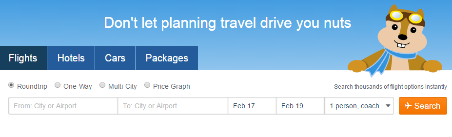
The orange button in Hipmunk design add a lot of visual interest.
Yellow
Sun, Happiness, Attention
Oddly, yellow represents both happiness and anxiety. In design, yellow is very effective for attracting attention, making it a color often used for warning signs (it can be associated with danger, though not as strongly as red).
When combined with black, it can gain a lot of attention. A good example outside of digital design would be a New York taxi cab.

Yellow is seen before other colors when placed against black. Breitling use this property to focus visitor’s attention on a button “Discover the Entire Range.”
Green
Nature, Growth, Success
The most obvious association with green is nature. Since most plants are green, it is also associated with growth and health.
In design, green can have a balancing and harmonizing effect. Green’s balance lends itself to calls-to-action, but as a designer you should pay attention to color saturation. Saturated green colors are exciting and dynamic to the eyes, they grab a lot of attention. This is why they work well for call to action buttons.
Blue
Comfort, Relaxation, Trust
Blue is the color of the sea and the sky. It’s one of the most important colors in UI design, and one of the most frequently used. In design, the exact shade of blue you select will have a huge impact on how your designs are perceived:
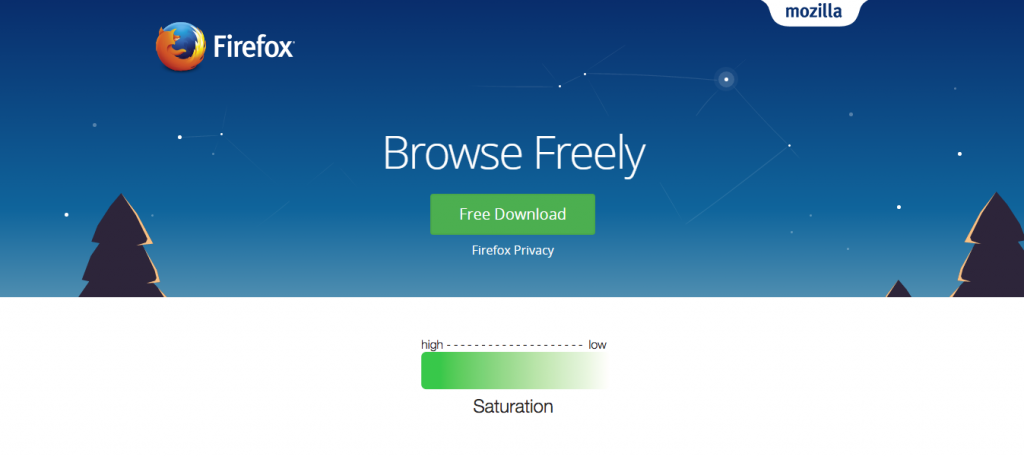
- Light blue can be refreshing, free, and calm. This relaxing friendliness also translates into inherent trust, which is why it’s often used by banks.
- Dark blues are excellent for designs where strength and reliability are important.
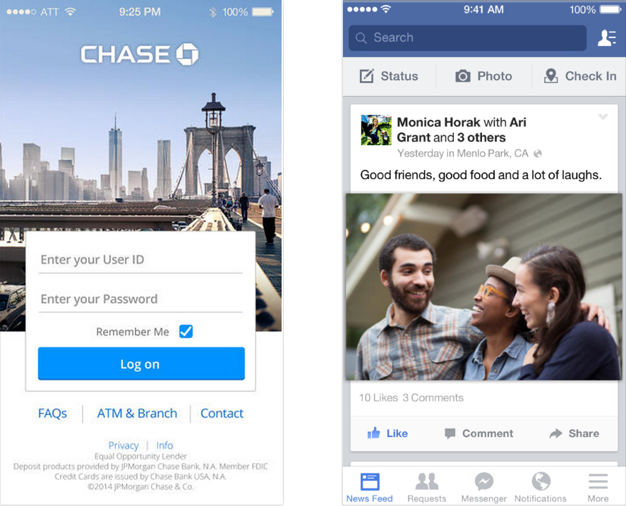
Blue is often associated with stability.
Purple
Luxury, Spirituality, Creativity
Purple’s rarity in nature and the expense of creating the color has given purple a special role in design. Historically linked to royalty, purple retains a feeling of luxury even today. Purple insinuates that a product or site is high-end, even if it’s not.
An interesting fact is almost 75 percent of children prefer purple to all other colors.
Most young people view purple as a happy color.
Black
Power, Elegance, Sophistication
Black is the strongest of all colors: it attracts attention quickly, which is why it’s most commonly used for text and accents.
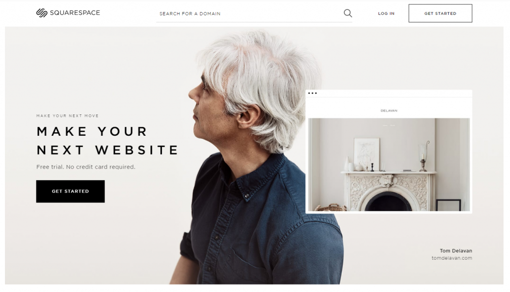
Black ‘Get started’ button is one of the first thing that catches the eye when enters Squarespace website.
When used as a main component in a color scheme, such as a background, black creates its own emotional ties. It can make it easier to convey a sense of sophistication and mystery in a design.
White
Health, Cleanliness, Virtue
White is often associated with purity, cleanliness, and virtue. Because of the fact that white is often connected with health services and innovation, you can use this color to suggest safety when you want to promote medical or high-tech products.
In design, white accents other colors around it, making it a popular choice for a secondary color. A proper use of white space is a powerful design feature. Take, for example, Google search homepage. It’s clear that white lets other colors in a design have a larger voice:
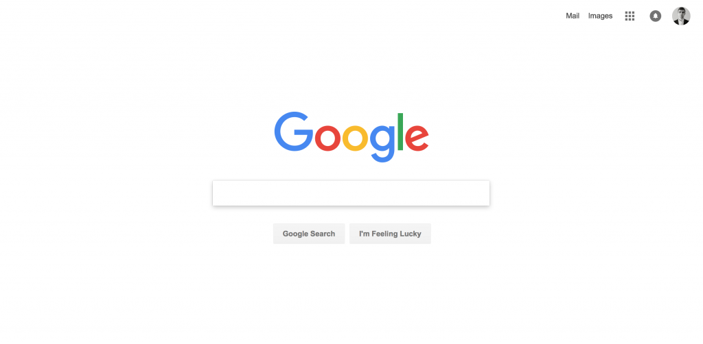
Generous white space creates the spaces around elements in the design to help them stand out or separate from the other elements.
Grey
Formality, Neutrality, Professionalism
Gray represents neutrality. It’s a safe color to use with other colors. When used as a primary color, gray gives the impression of formality, but that doesn’t always mean a bad thing. Similar to white, you can use a gray background to make other colors stand out.
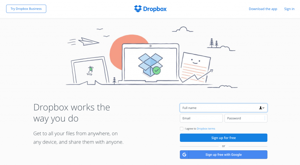
Grey commonly combined with brighter accent colors. Dropbox use grey to highlight CTA buttons.
Gender and Color
While there are no concrete rules about what colors are exclusively feminine or masculine, there have been studies conducted over the past eight decades that draw some generalizations. Although findings are ambiguous, many studies have indicated that there are differences between gender in preferences for colors:
Most Favorite Colors
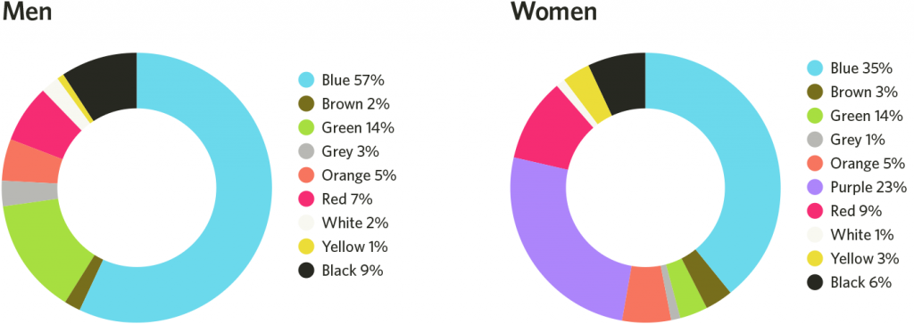
Least Favorite Colors

Image credit: Helpscout
- Blue is the most popular color for both men and women. Males are significantly more likely than females to prefer variations on the color of blue.
- The most unpopular colors for both men and women are brown, orange, and yellow. Grey is one of the least favorite colors for females, and purple is one of the least favorite color for men.
- When it comes to shades, tints, and hues, men generally prefer bold colors while women prefer softer colors.
- Most people think that the universally-loved female color is pink, but it’s not. Only a small percentage of women choose pink as their favorite color. Thus, while pink may suggest femininity in color psychology, this doesn’t mean that pink is appealing to all women, or even most women.
Color in Business
The importance of colors in branding
Color takes center stage in many brands’ philosophy of design. Every color that we see implies something, either directly or indirectly, that helps drive our perception of individual brands. Some colors go beyond their brands, defining entire industries, such as blue for the travel industry, green for health, and red for fast food.
However, when it comes to selecting a color scheme for your brand there’s no hard and fast rule. While some companies choose to use their industry’s common colors, others have found that going against traditional expectations can be a very effective way to make an impression. For example, Virgin America chose to go against the grain with the design on their site and in their app. While it might not be what users would expect from an airline website, it certainly stands out.
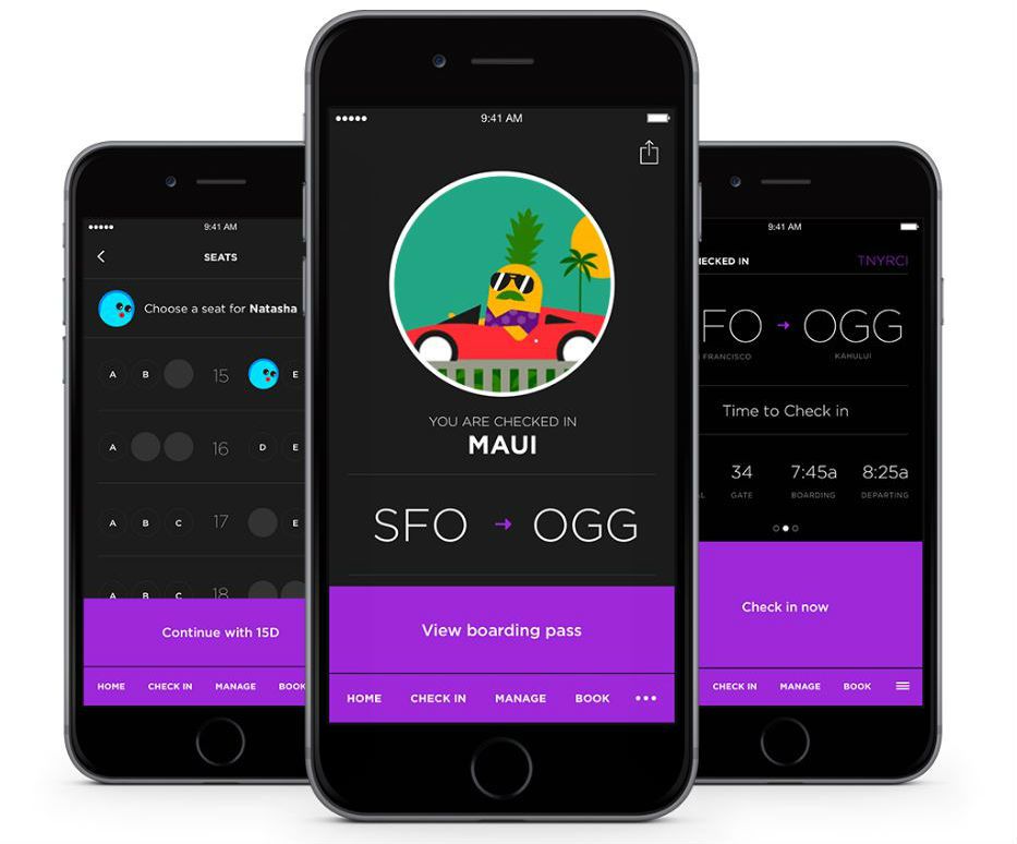
There’s not a drop of blue to be seen in Virgin America’s app for iOS.
Thus, choosing unexpected colors can be an effective way to make users remember your company.
Color and conversion rate optimization
How can you use color theory and psychology to get people to click on a button? Call to action button color is one of the longest standing debates in the world of conversion and optimization. For every expert who claims that an eye-catching red is the best color for a button, there’s another one who says that green is the best because green color is safe and means “go.”
HubSpot shared a test that showed how a change in the color of a CTA button made a drastic impact on signups.
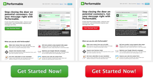
Performable’s A/B test for button color.
Even though they originally predicted the green button would perform better, the red button resulted in 21% more clicks. At the same time HubSpot warned their readers that test results are subjective (their audience likely prefered the red button because it was the only color that stands-out on the page).
The color of the button has little to no effect on it’s own. What works on one site, doesn’t necessarily work on another. Saying that one color converts better than another is simply wrong because there is no universal best color. However, there are rules of thumb that can help you use color to your advantage. One of them is the psychological principle known as the isolation effect which states that an item that “stands out like a sore thumb” is more likely to be remembered.
For example, if your site or app uses a lot of green, users probably won’t notice a green button right away, no matter how well red buttons performed in another company’s A/B test.
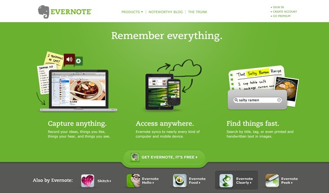
Get Evernote, It’s Free’ call to action button is buried because it has the same color as a background. The button is simply gets lost in the design – users can’t see it.
Thus, it’s essential to changes a visual hierarchy of the whole page to make a call to action stand out. Color contrast is important because if the button color does not get the attention of the potential customer you don’t get the sale/sign-up.

The CTA button color that really grabs people’s attention is the one that contrasts from the color scheme of the rest of the page.
Color and Usability
Design isn’t just about looking pretty — it’s about functionality and usability, the two principles that are arguably the most important to any UX designer. Color is a tool that can help guide the eye and good UI uses color to direct not just the user’s attention, but also their interactions with the entire experience.
Limit the number of colors
Applying color to a design has a lot to do with balance and the more colors you use, the more complicated it is to achieve balance. Using too many colors is a common design mistake, it can be like trying to convey a million feelings and messages at once, which can confuse the person viewing your design.
Too many different colors look bad, no matter which colors are used.
There is a simple interior design rule 60–30–10 that works well for many designs. It’s a timeless decorating technique that can help you put a color scheme together easily. 60% is your dominant hue, 30% is secondary color and 10% is for accent color. This formula works because it creates a sense of balance and allows the eye to move comfortably from one focal point to the other.
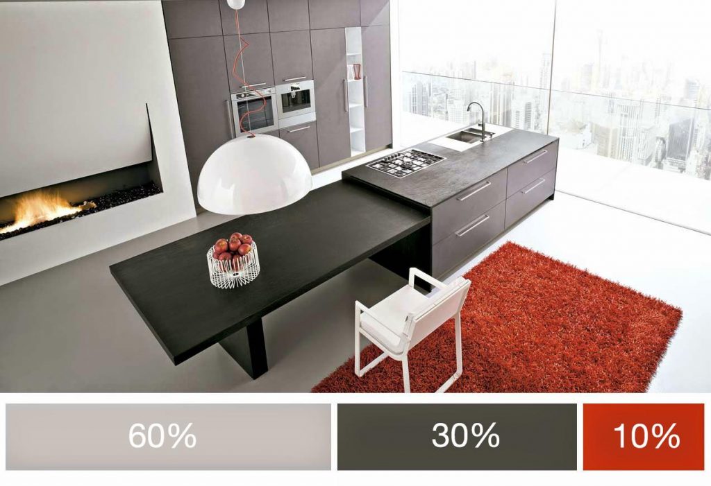
60% + 30% + 10% proportion is meant to give balance to the colors. Image credits: Facildecoracion
Design for accessibility
People see colors differently. Approximately 8% of men and 0.5% of women are affected by some form of color blindness. Red and green are the colors most affected by color-vision deficiency. Avoid using these color combinations as the only way to distinguish between two states or values.

Many colorblind people find it difficult to distinguish red from green.
Let’s examine one common case: have you ever gotten an error message when you’re filling out a form that says something like, “The fields marked in red are required”? While it might not look like a big thing, this error message combined with a form in example below can be an extremely frustrating experience for people who have color-vision deficiency.
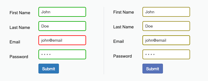
The form field design relies only on red and green to indicate fields with and without an error. Color blind users cannot differentiate the fields highlighted in red.
As said in W3C guidelines, color shouldn’t be used as the only visual means of conveying information, indicating an action, prompting a response, or distinguishing a visual element. For form mentioned above designer should give more specific error messages like, “The email address that you entered is not valid” or at least provide an icon near the field which requires user attention.
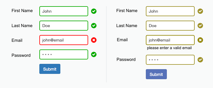
Additional visual cues and inline error copy helps indicate field with an error.
Broadly speaking, there are some great tools available to help you test your UI’s accessibility:
- WebAIM Color Contrast Checker helps you check your color combinations.
- With Adobe Photoshop, designers can proof images with Color Universal Design to ensure that graphical information is conveyed accurately to people with various types of color vision impairment, including people with color blindness.
Conclusion
We’ve covered several color-related factors that can affect the user experience on your site or app, but still didn’t find an answer on our question: how to find the “right” color? You likely already know the answer: there is no ‘best color’ for conversions. The real value of colour in design does not lie in single colours, but in what colours you have and how you combine them. This idea is clearly expressed in the Material Design quote:
“There are no wrong colors. What matters most is how to use them.”
If you plan to give your conversions a serious lift you need to do conversion research. Serious gains in conversions come from analyzing what your users really need, the language that works for them, and how they want to buy the product. The right design decision is the one that your users think is right.
Leave a Reply
Want to join the discussion?Feel free to contribute!