Best Practices for Background Images: Your “Getting Started” Guide

In this post Karol K (blogs.adobe.com) covers primary uses for background images. Karol (@carlosinho) is a blogger and writer, published author, and founder of NewInternetOrder.com. Image courtesy tashka2000 via Bigstockphoto.
In the era of simplicity and minimalism – or modern web design, as some people like to call it – the background is often one of the few elements of design that convey any sense of branding.
Big and bold typography, ghost buttons, “flat,” “material” … whether we like it or not, they all look kind of the same. So if you want to opt for that minimalist style, the only tools that are left for you to make the website stand out is the logo, the layout itself, and, chief of them, the background.
Here are the options you have when it comes to image backgrounds, plus how to make your next background awesome:
The old-school background – solid color
If you want to keep things old-school, you can experiment with solid color backgrounds.
For some scenarios, they can look good, but they can also be a bit harder to execute when you want to keep the design minimal. Solid colors can make it too minimalist and not interesting enough to grab the visitors’ attention right away … in a word, dull.
On the other hand, traditionally, those were the backgrounds that were the easiest to make work from atechnical point of view. After all, solid colors always scale well on all devices and screen sizes, they’re consistent and predictable. Several years ago, when CSS wasn’t a thing yet, we didn’t have much of a choice other than going with solid backgrounds. Today, however, there are other background options to select from.
Some tips if you still want to experiment with solid color backgrounds:
- Make sure to spend a significant amount of time tuning the background-to-text contrast and color pairing.
- Picking the right colors and their combination decides the emotional charge of the whole design – it can agitate the visitor or make them more calm. As a designer you simply need to be aware of the effect that your solid background is having, and that sometimes this effect can be more pronounced than with photo backgrounds (more on them in a minute).
For example, colors that are nearer on the color wheel can have a more calming effect (depending on the specific colors you choose), while colors from the opposite sides of the wheel make for a more attention-grabbing “background + foreground” combo. For pictures, you will have a range of different colors on the same picture, hence the emotional impact can be a bit more blurred.
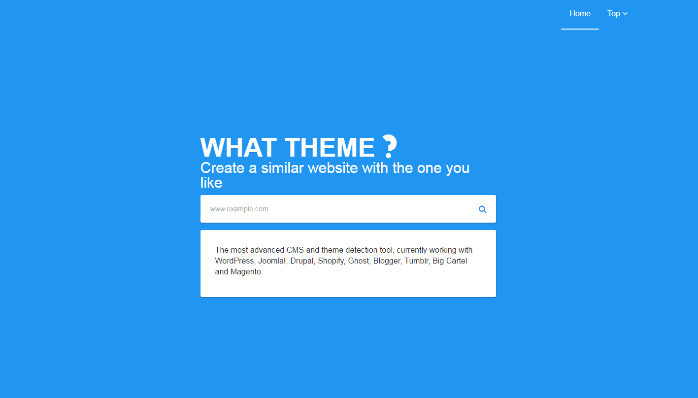
Some examples. By WhatTheme.com:
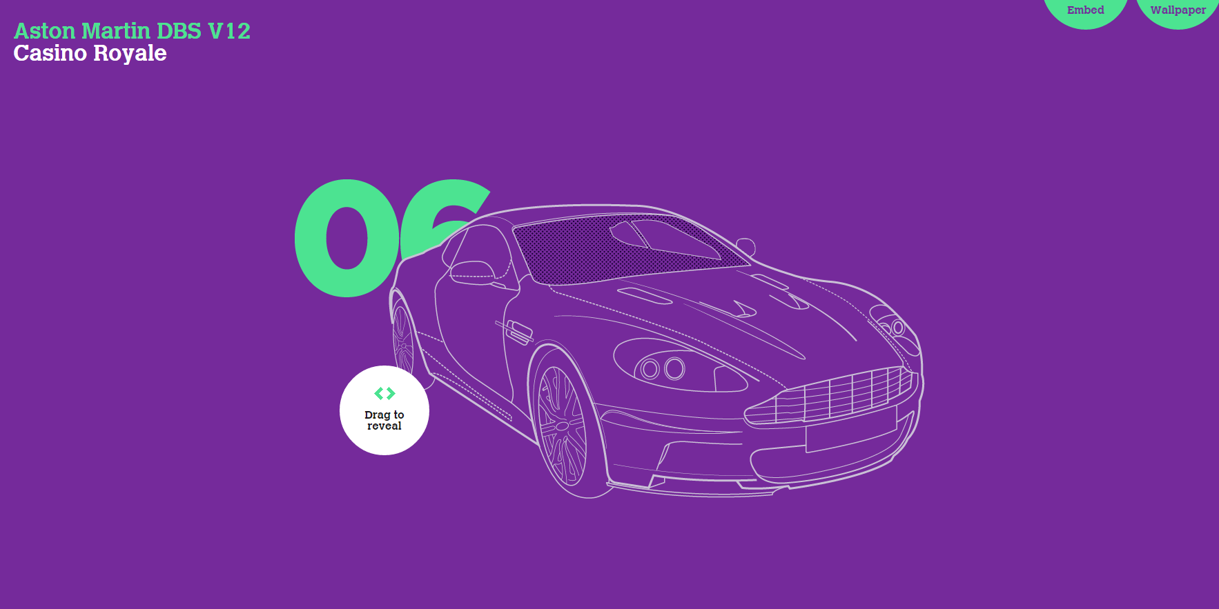
By James Bond 007 Cars Evolution:
Using image patterns
The other path you can take is using image patterns instead of solid color backgrounds.
The advantage that patterns have over solid color backgrounds is that they remain similarly simplistic, but they also let you introduce more branding and thus make your design more unique.
When building the pattern itself, you can take advantage of the same color principles and emotional triggers while also including additional elements – ones that make the pattern original.
From a technical point of view, a good pattern image needs to be repetitive, so that it scales no matter what the screen size of the device is. But on the other hand, you need to be careful and not make the whole design too mesmerizing.
Don’t forget that even the most artsy of patterns is still meant to serve as a background, and as such it shouldn’t take up too much of the visitors’ attention.
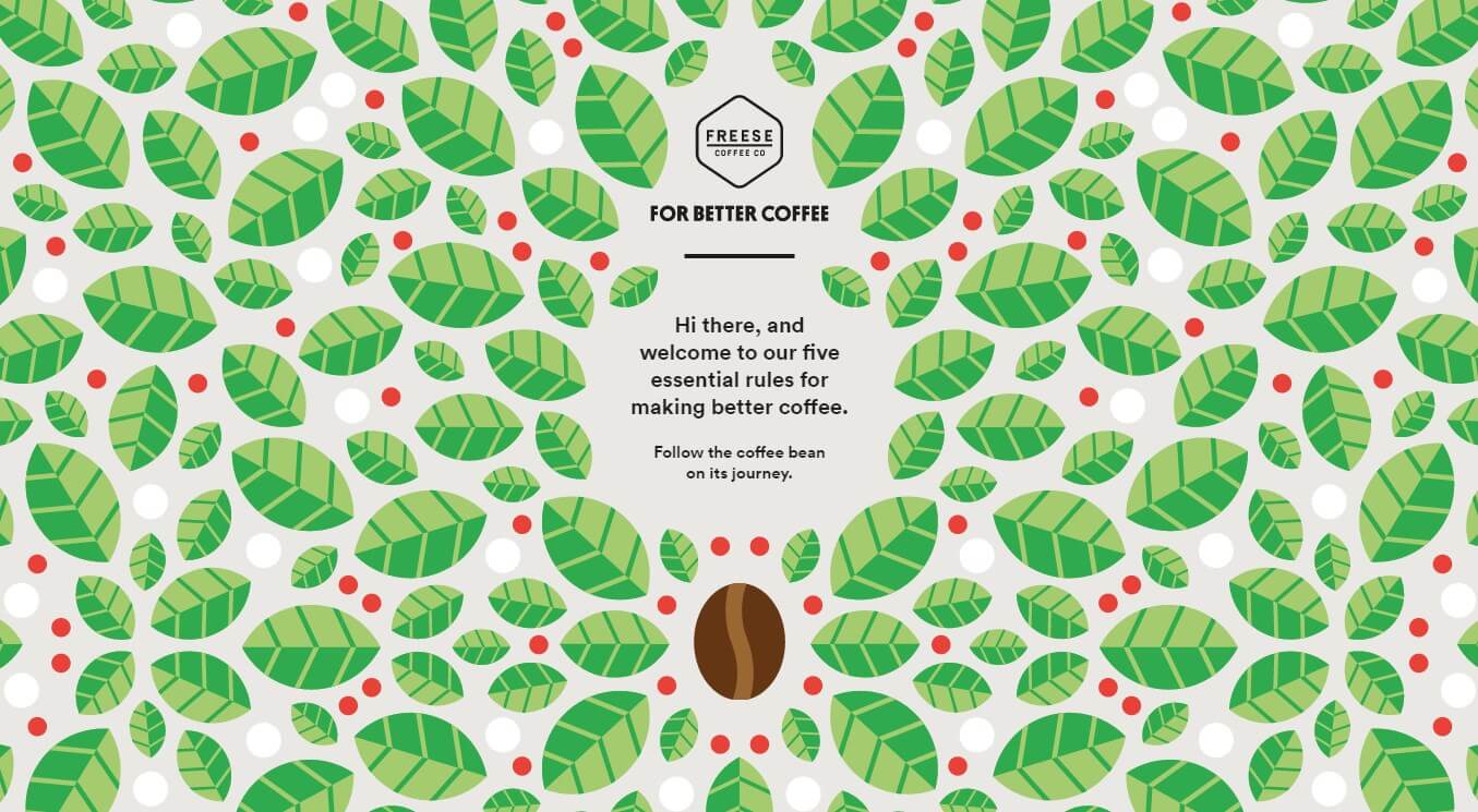
Take a look at this example by For Better Coffee. It looks quite great on a standard screen:
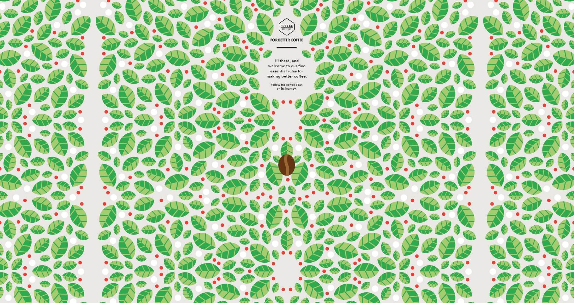
But on 4K, looking at it becomes rather difficult:
There are a couple of things you can do in such situations – when dealing with background image patterns that you want to look great on all types of screens:
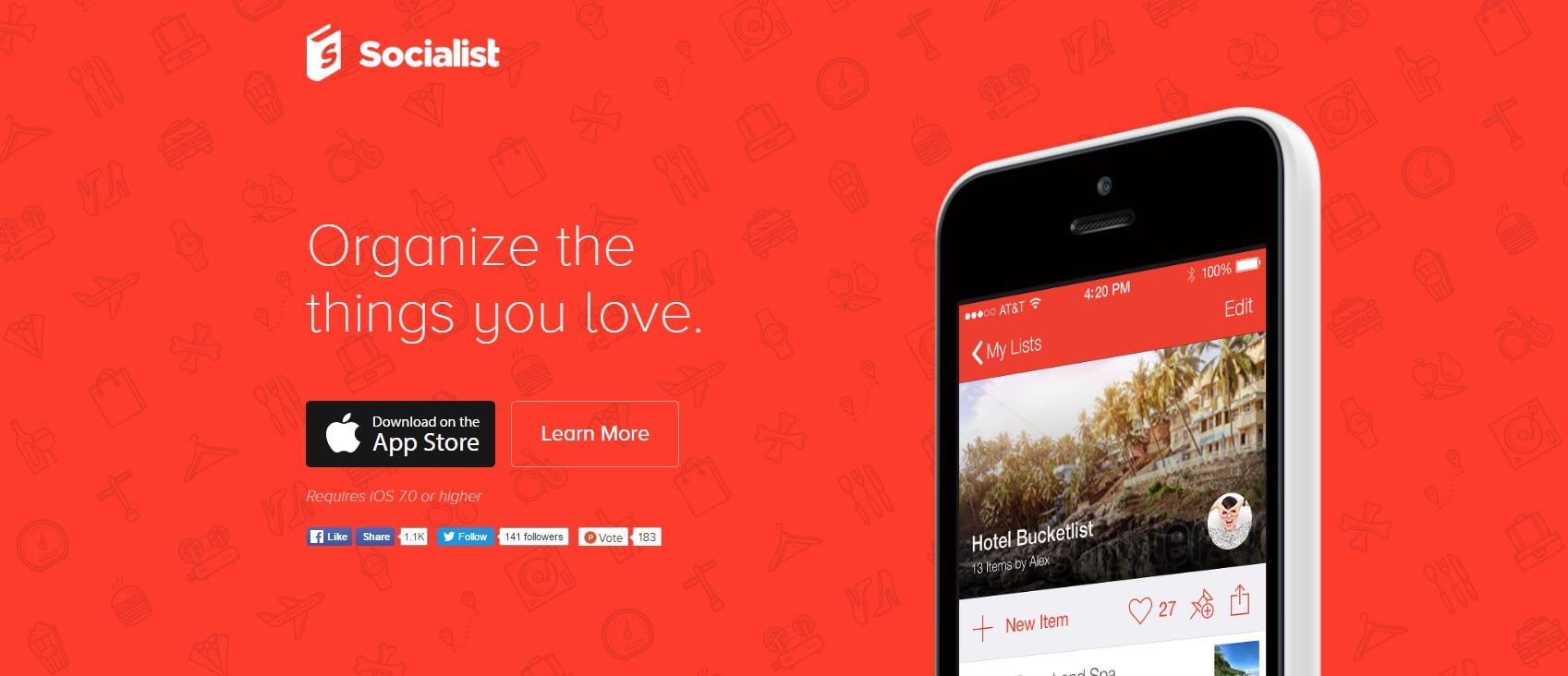
(a) Make the pattern discreet – with the foreground elements (the ones that make up the pattern) being in soft contrast to the background color.
This sort of approach makes the background not shout too much, and still look good even on a huge screen.
Example by Socialist:
(b) Make whitespace part of the pattern.
In this approach, the standard pattern elements are broken down visually by blocks of pure whitespace.
Since the pattern itself takes up the majority of the graphic, it serves its purpose sufficiently well, while the whitespace allows the viewer to rest their eye on something that doesn’t cause a headache.
(c) Make the pattern scale along with the screen – make it responsive (we’ll talk about responsive backgrounds more in just a minute).
Quite simply, the goal here is to fit the same amount of individual pattern blocks in the visible part of the screen regardless of its actual size.
(d) Make the pattern block as big as you can afford to.
The idea of a pattern is pretty simple. You take the image and repeat it vertically and horizontally, and indefinitely.
But as presented above, doing so on a huge screen can be too mesmerizing to look at. So, another way to overcome this problem is to try making a single pattern block (single repeatable image) as big as you can afford to.
In other words, you’re making the pattern much more complex than it would be when comprised of smaller individual elements.
Granted, the pattern still can’t be too shouty if the visitors are likely to see it on big screens.
Do you need a background image or a hero image
The difference between background images and hero images can be sometimes confusing.
To some extent, they’re the same thing (please bear with me on this one for a minute).
A hero image is something that appears in the head section of a website and serves as “background + foreground” combo. However, if the visitor doesn’t scroll down, or if the hero section takes up the whole height of the viewport then it effectively becomes the background for everything that’s currently visible on the screen.
So when to go with a hero images vs with a whole custom background?
Think of it this way:
- if you want to achieve one specific thing, and you want to put emphasis on that thing in a unique way – use a hero section,
- if you want to create a general vibe for the whole design – use an image background.
Background images the right way
First off, don’t treat the background and the foreground separately. They’re basically one complete thing that delivers a specific result or achieves a specific goal.
The most obvious background mistakes come up exactly as a direct result of thinking that picking your background is an entirely different process from then putting something on top of that background.
But there’s more:
a) Make sure the quality is on point
On the one hand, we all know that we should only use images of sufficient quality, and that having anything pixellated on the screen will have a negative impact on the user’s experience – mainly by distracting them.
There’s a great tutorial on preparing images for the web by Nathan Segal with Photoshop, so feel free to hop over there for more info.
In a nutshell, though, make sure that your background image checks off on these:
- Don’t compress the image to the point where it becomes distorted or pixellated.
- For photo backgrounds, or any images with multiple colors and color gradients, use the JPG format.
- For background images with blocks of solid color, use the PNG format (usually great for pattern images).
- If using full-screen backgrounds, make the graphics 1920 pixels wide (full HD).
- (Optionally) Provide alternative backgrounds for 4K displays.
b) Consider using abstract images
Abstracts are often an easy way out if you want to use a background image. Or, rather not an easy way out … more of a simple way out.
Abstract images can work great if you want to add something unique to a minimalist layout, but you don’t want to make the design too cliché, considering the “huge background image” trends of today.
They can also introduce a more creative feel to your design, but still let you put sufficient focus on the copy/text that’s on the page – something that can be more difficult to achieve with a photo background.
The only difficulty with abstracts is that they often need to be created from scratch – from a blank canvas entirely, unlike with photo backgrounds, which start from … well, a photograph.
The downside of abstract image backgrounds is also that the design can become boring and uninteresting to returning visitors much sooner than a photo image. Depending on the complexity of the abstract, simply, there might be nothing to look at the second time around.
Example by HBM FiberSensing:

c) Make your backgrounds responsive
There are three main ways of making your image backgrounds responsive:
You can make the background repeat itself both horizontally and vertically, similarly to how a pattern works. But this is really difficult to pull off with a photo background without some next-level Photoshop trickery.
What this means in practice is that this method is basically only applicable to abstract image backgrounds.
Use an image that looks equally well on small and big screens when scaled. Depending on the detail on your background image, you might be able to make it work both on small and large screens in its default, full-screen appearance.
Most commonly, this works well for landscape photo backgrounds, and not so much for “people backgrounds.” I’m sorry, but I don’t want to look at someone’s face at 4K resolution. (Or maybe it’s just me?)
That being said, making a background re-scale along with the size of the viewport is an easy thing to implement (CSS-wise), so you can quickly check how your background behaves in a scenario like that.
Use “smart scaling.” Sounds mysterious, doesn’t it? So here’s what I mean – instead of having your background image scaled along with the viewport (like described above), you can process the image in a way so it reveals more details as the screen gets bigger, and hides details as the screen gets smaller (but while still keeping the most important parts visible).
Here’s an example by SumoMe:

This sort of thing is achievable with CSS, or by providing different background images for specific screen resolutions. Either way, using this method, you can make sure that your visitors always get the most optimized version of the background image possible.
Start with the copy
This is probably the most counterintuitive piece of advice here, but it just needs to be said.
All web design work – backgrounds included – starts with the message that the website needs to convey to its audience. And the message usually means the words.
So, as weird as it might seem at first, start your background work by deciding on what needs to be said on top of the background, or even by preparing the first draft of the copy.
That way you will make sure that the purpose of the message and the presentation of the background are congruent. Going the other way around can result in the background simply looking out of place … even if it’s awesome as a stand-alone graphic.
Conclusion
In the end, using an elaborate background is certainly harder than using a solid color one. Solid colors look the same on all screens and all devices. Plus, you don’t have to worry about some text interfering with the background – making the text more difficult to read or even completely unreadable.
But on the other hand, photo backgrounds are much more unique, and tend to do a better job when it comes to creating a specific vibe or showcasing your brand, ultimately making the whole website more memorable.
Leave a Reply
Want to join the discussion?Feel free to contribute!